About The Artist
Living in the midst of the Norfolk countryside and a stone’s throw from the coast is the perfect setting for making art. As you can see from my work I am fascinated by the seashore and by trees and woods and here there is an abundance of both on my doorstep.
The truth is that I don’t want to tell the viewer anything at all, I simply hope viewing the picture conjures up memories, stories or feelings in them, drawing out rather than me putting in. If someone feels a little happiness when they look at one of my pictures, then my job is done.

Inspiration
Inspired by the beauty of the Norfolk countryside.
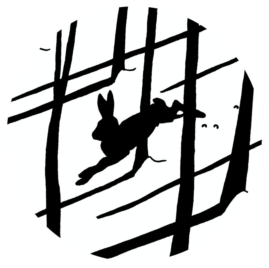
I am lucky to have a very retentive memory. As I travel around I see things that appeal to me, shapes, shadows, colours and clouds, even perspectives and somehow, they are captured in my memory and then pop out days, weeks or even months later. I don’t pretend to understand how or why this works, it just does and saves on having to use reference photos. I do have a sense of the dramatic and love strong leading lines together with black outline and shadow. Visually, my favourite times of the year are early Spring and late Autumn, the angle and strength of the sun is such that it throws strong, deep shadows across the scene; but overall, I guess I am inspired by life itself, quite simple really.
Techniques & Materials
Techniques
To show how a work is produced I’ve taken one of my recent pictures called Breaking Free to illustrate some of the stages:
")
The image is drawn on 140lb HP paper including the 0.5cm border which is a trademark of my work. I then start with the black outline around the main parts of the picture using a rather old-fashioned dip pen with Indian ink. The original drawing is based on a silhouette of Cromer from previous work, pines from our wood and imagined balloons.
")
Once I am reasonably comfortable with the outlined ‘skeleton’ of the work the main areas of black are added using a brush and gouache. This is where I see if the painting is going to be balanced or not, if not then the black needs adjusting so the picture doesn’t appear lop-sided. It is possible to overpaint black gouache with a dark colour, but not something I’d choose to do!
")
Getting the black structure right is a very large part of my paintings, once the original design and the black are complete the picture is well on the way to being finished. The next step is to lay in the larger areas of block colour. These are important as along with the blacks they form a background for the more detailed parts.
")
The final stage is to add the details, here that is the silhouette of Cromer and the balloons. The silhouette was outlined in gouache applied with a dip pen to give a sharp edge and the balloon strings were put in using a very fine marker pen. The highlights are white Indian ink, I find they contrast well with the areas of black to bring the whole image alive.
Techniques & Materials
Materials
The materials I use are very straightforward. The paper is Arches 140lb HP, 12” x 16”, it has a brilliant surface that takes a lot of punishment from steel nibs and is far superior to its competitors. I usually work on two pictures at a time so two or three blocks. The black ink is always Indian ink, I find it is very water-resistant whereas acrylic based inks will always spider however long you leave them to dry. My white ink is Sennellier white Indian ink, the best I’ve found.
My paint is always gouache (a bit like grown-up poster paint). I use that for a number of reasons. This technique demands a very flat finish over large areas of colour and a pure, rich pigment that will give an even, opaque layer of body colour. Gouache gives that, together with a very strong colour range to satisfy my need for vibrant colours with a similar tonal range. I use what I consider to be the best gouache paints and they are Daler Rowney, Winsor & Newton and Royal Talens. They all apply easily, are extremely lightfast, the ranges mix well and the pigments have very little show-through when scanned.
")
Original Paintings
I do not produce many paintings in a year, maybe ten or twelve if I work really hard! It means there are some for sale from time to time, but they go very quickly, so I don’t offer them on the web. They are available either directly from my studio during the year or when I am open to visitors pre-Christmas or during Norfolk Open Studios; alternatively, from selected galleries in the local area. The majority are gouache works 40cm x 50cm but I do some larger deep canvases, mostly as a version of an original gouache, at about 70cm x 100cm. I do not undertake commissions.
If you are interested in being kept informed when originals are available then please sign up to my Mailing List
Print Gallery
My prints fall into two main categories, the Limited Editions and the Open Editions.
Limited Edition prints are produced using archival inks, paper and mounts in editions strictly limited to a run of 75 copies; after that the Limited Edition ends. Print number records are strictly kept and made available to galleries that stock my work. All these prints are titled, numbered and signed beneath the image.
Open Edition prints are an edition without limit on numbers. As such they are cheaper than the Limited Editions. They are also smaller and tend to be monochromes or hand-coloured prints. Again, they are produced using archival inks, papers and mounts. The hand coloured prints have spot colour, cadmium yellow artist’s watercolour, applied by hand prior to mounting. Again, each print is titled and signed by hand beneath the image.